
If you are planning to design your website, then having a navigation bar or simply a navbar is a must to help users to go through all the pages of your website with an ease. This also helps you to brand your company’s logo at every page of your website.
Now, websites need to be responsive as they are accessed widely on desktop, tablets and phones.
So, in this article we will learn how to make one for ourselves
We will be using Bootstrap for front-end design since it is easy to use and provides much flexibility
Find a text editor for yourself, I am using Visual Studio Code.
So, lets get started!
Adding Bootstrap
Now to use Bootstrap in your project, you will need to add a bootstrap stylesheet and script as shown below
 <!DOCTYPE html>

 <html lang="en">

 <head>

     <meta charset="UTF-8">
     <meta http-equiv="X-UA-Compatible" content="IE=edge">
     <meta name="viewport" content="width=device-width, initial-scale=1.0">

     <title>HTML Form</title>

     <link href="https://cdn.jsdelivr.net/npm/bootstrap@5.0.0-beta2/dist/css/bootstrap.min.css" rel="stylesheet" integrity="sha384-BmbxuPwQa2lc/FVzBcNJ7UAyJxM6wuqIj61tLrc4wSX0szH/Ev+nYRRuWlolflfl" crossorigin="anonymous">

 </head>

 <body>

     <script src="https://cdn.jsdelivr.net/npm/bootstrap@5.0.0-beta2/dist/js/bootstrap.bundle.min.js" integrity="sha384-b5kHyXgcpbZJO/tY9Ul7kGkf1S0CWuKcCD38l8YkeH8z8QjE0GmW1gYU5S9FOnJ0" crossorigin="anonymous"></script>

 </body>

</html>
Other than the general HTML format using div, span, anchor tags, and few others specifically for the navbar. We will discuss them alongside the code
So, depending on the type of navbar you wish you display on your website, which includes using a search bar on the top or not, adding your company’s logo or just the company name or both, or providing a specific link to your social media account or any other website directly in your navbar, adding a dropdown menu if you have just too many essential links of pages to provide to your user
Whatever bits of the above components you require, you will need to initiate your navbar with a nav tag. Now, Bootstrap simplifies your work by providing you multiple classes, so all you have to do is select according to your requirement and just add them!
Also Read How to Design a Form using HTML
Designing a general Responsive Navbar
Using the navbar-expand-lg class keeps your navbar expanded for devices with screen size larger than or equal to 992px.
For devices with screen size smaller than this, the navbar will collapse with a toggle button to show the complete menu.
You can vary the expansion of the screen size by altering the lg with sm, md, xl or xll
Below are the breakpoints and their dimensions
| Breakpoint | Class infix | Dimensions |
| X-Small | None | <576px |
| Small | sm | ≥576px |
| Medium | md | ≥768px |
| Large | lg | ≥992px |
| Extra large | xl | ≥1200px |
| Extra extra large | xxl | ≥1400px |
Now if you wish to place your company’s logo along with your company name, then use the img tag as shown below along with the company name (for example MyForms). You can alter the size of the logo using the width and height.
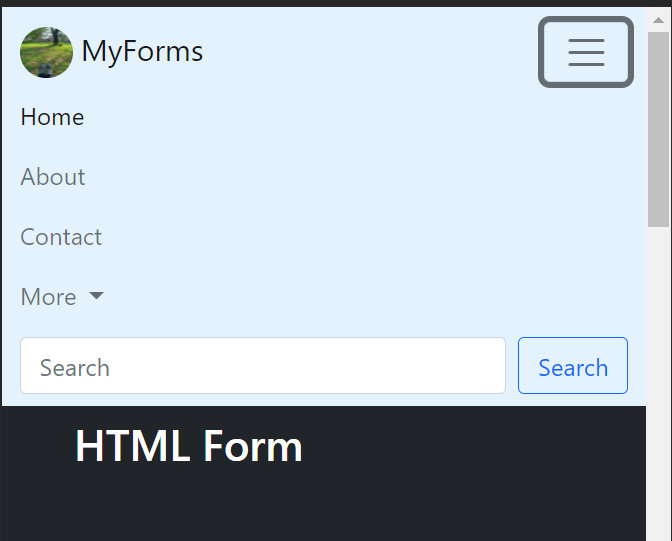
If you want to make a rounded logo like i have done (see the image below), then add class “rounded-circle” to the img tag.
Once, your navbar gets collapsed, you need to display the toggle icon.
 <nav class="navbar navbar-expand-lg navbar-light bg-light">

     <div class="container-fluid">

       <a class="navbar-brand" href="#">

         <img src="/logo.jpeg" alt="" width="30" height="24" class="d-inline-block align-top">
         MyForms

       </a>

       <button class="navbar-toggler" type="button" data-bs-toggle="collapse" data-bs-target="#navbarSupportedContent" aria-controls="navbarSupportedContent" aria-expanded="false" aria-label="Toggle navigation">

         <span class="navbar-toggler-icon"></span>

       </button>

  </div>

</nav>
Next, mention the navbar items along with the specific page links for Home, About and Contact
Since Home page is our current page, we give it the class active along with the nav-link.
 <nav class="navbar navbar-expand-lg navbar-light bg-light">

     <div class="container-fluid">

        <a class="navbar-brand" href="#">

            <img src="/logo.jpeg" alt="" width="30" height="24" class="d-inline-block align-top">
         MyForms
       </a>

       <button class="navbar-toggler" type="button" data-bs-toggle="collapse" data-bs-target="#navbarSupportedContent" aria-controls="navbarSupportedContent" aria-expanded="false" aria-label="Toggle navigation">

            <span class="navbar-toggler-icon"></span>

       </button>
       <div class="collapse navbar-collapse" id="navbarSupportedContent">

           <ul class="navbar-nav me-auto mb-2 mb-lg-0">

                <li class="nav-item">

                     <a class="nav-link active" aria-current="page" href="./home.html">Home</a>
                 </li>

                 <li class="nav-item">

                   <a class="nav-link" href="./about.html">About</a>

                 </li>

                 <li class="nav-item">

                     <a class="nav-link" href="./Contact.html">Contact</a>

                 </li>

       </div>

</nav> 
I have added the navbar code to the HTML Form we created last time
Adding Dropdown to Navbar
At times, providing multiple page links to the users is a necessity but keeping your page clean and tidy is also important. So using Dropdowns are the best way to achieve this.
Adding divider in dropdown
To add a divider use the hr tag along with the class dropdown-divider
 <nav class="navbar navbar-expand-lg navbar-light bg-light">

       <div class="container-fluid">

           <a class="navbar-brand" href="#">

              <img src="/logo.jpeg" alt=""  width="35" height="34" class="d-inline-block align-top rounded-circle">
         MyForms
          </a>

         <button class="navbar-toggler" type="button" data-bs-toggle="collapse" data-bs-target="#navbarSupportedContent" aria-controls="navbarSupportedContent" aria-expanded="false" aria-label="Toggle navigation">

              <span class="navbar-toggler-icon"></span>

        </button>

       <div class="collapse navbar-collapse" id="navbarSupportedContent">

            <ul class="navbar-nav me-auto mb-2 mb-lg-0">

                <li class="nav-item">

                   <a class="nav-link active" aria-current="page" href="#">Home</a>

                </li>

                <li class="nav-item">

                    <a class="nav-link" href="./about.html">About</a>

                 </li>

               <li class="nav-item">

                  <a class="nav-link" href="./Contact.html">Contact</a>

               </li>

               <li class="nav-item dropdown">

                  <a class="nav-link dropdown-toggle" href="#" id="navbarDropdown" role="button" data-bs-toggle="dropdown" aria-expanded="false">
               More
                 </a>

             <ul class="dropdown-menu" aria-labelledby="navbarDropdown">

                 <li><a class="dropdown-item" href="./team.html">Team</a></li>

                 <li><a class="dropdown-item" href="./style.html">Styles</a></li>

                 <li><hr class="dropdown-divider"></li>

                 <li><a class="dropdown-item" href="./forms.html">Make your own form</a></li>

             </ul>

           </li>

      </ul>

   </div>

</nav> 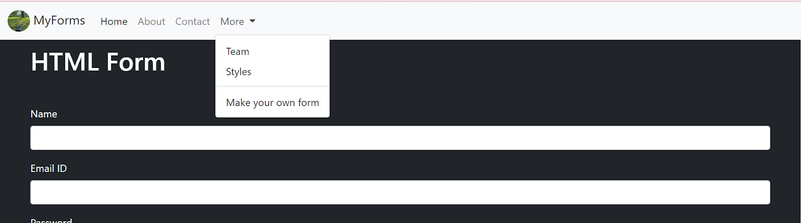
Adding Search Bar in the Navbar
If your website provides multiple options for a user to choose from, for example educational websites like Coursera or udemy provide enormous amount of courses, and scrolling the entire content to find your desired course would be a task, So adding a search bar in such cases provides your users an ease
 <nav>

 <form class="d-flex">

           <input class="form-control me-2" type="search" placeholder="Search" aria-label="Search">

  </form>

</nav> 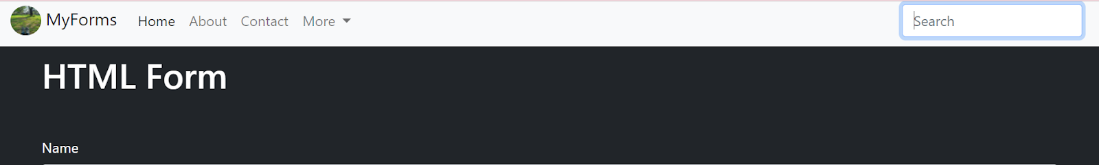
Adding Button to Navbar
Adding a Button either login /signup or just a button along with the search bar is great!
 <form class="d-flex">

           <input class="form-control me-2" type="search" placeholder="Search" aria-label="Search">

           <button class="btn btn-outline-success" type="submit">Search</button>

</form> 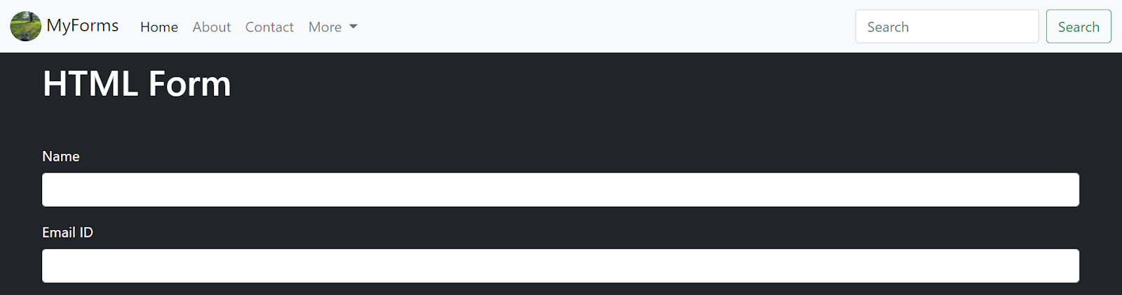
You can change the button styles, fill it with color or give it an outline.
Bootstrap gives you some predefined colors which can be used simply by adding specific classes , but you can customize the color and style as well.
Below I have listed a few of them
Instead of “btn-outline-success” class which gives a green outline to button as shown above, you can use btn-outline-primary to give a blue color
Btn-outline-danger gives a red color
Btn-outline-warning for yellow
Btn-outline-dark for black
Btn-outline-light for white color
And if you want to completely fill the button with color, remove the word outline from the class
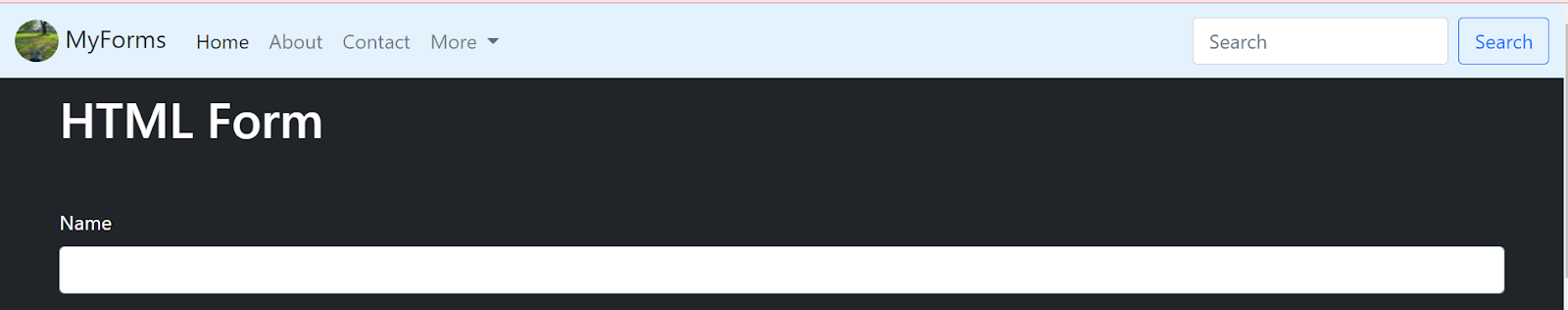
Changing color schemes of Navbar
We added components to our navbar according to our requirements, but a white colored navbar might not go with the color scheme of your website.
So again, just like customizing button colors, you can customize the color of your navbar or simply use the ones predefined by Bootstrap
To give a dark background to your Navbar use the classes navbar-dark and bg-dark
<nav class=”navbar navbar-expand-lg navbar-dark bg-dark”>
….
</nav>

To change it to light blue,
<nav class=”navbar navbar-expand-lg navbar-light” style=”background-color: #e3f2fd;”>
….
</nav>
Collapsed Form of Navbar
And we are done
Using such simple classes you can design your own responsive Navbar!